I have been waiting for AGES for someone to ask for our opinions on their drawings! I have been DYING to see some drawings and have had an itching to constructively criticize some... >3< u have made me very happy...
Anyway...
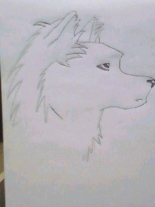
Your drawing is very good and certainly has a unique, cartoony quality to it, but I to have some suggestions to help u improve.
- The chin is a bit oddly shaped, as well as the forehead. Not that these are flaws, but it's not quite realistic. It would certainly help u a lot if u were to use foto reference. Google afbeeldingen and deviantART are good places to look for that.
- The eye is a bit... dis-positioned. Again, foto reference is always nice when you're starting out.
- The fluff around the ears and back makes that part of the body look disconnected from the rest of the body. Erasing some of the harsher lines should fix that.
- The eye, while well drawn, is a bit lacking in depth. Pay close attention to color gradient and light when you're shading an eye.
- Though there is fluff, there is little to no vacht, bont texture. vacht, bont texture is hard to do, but with practice and tutorials, u can master it in no time. Youtube and deviantART are good places to look for tutorials on drawing.
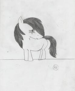
Ah, also, if it's of any help, I have a drawing of a wolf that I did recently
link that u can use as a visual example if I didn't explain something well. Even though my scanner killed the quality.
I hope I've helped you! ^^